Blog - CSS Animation
서론
오늘은 CSS Animation에 대해서 알아보자. 웹에 접속했을 때 화면이 현란하게 움직이는 것을 본 적이 있을 것이다.
예를 들어, 스타벅스 공식 홈페이지에 들어가서 보면 이미지가 뿅뿅하고 튀어나오는 것을 볼 수 있다.
이렇게 화면에 자동으로 나타나는 움직임들을 Animation이라고 한다.
그리고 반응형으로 커서가 올라가거나 클릭하면 동작하는 것을 Transition이라고 한다.
이번 시간에는 Animation에 대해 살펴보자. 꽤나 흥미롭다.😝
아래 글부터는 개조식으로 작성됩니다.
1. 색상 변화 Animation
.object {
  width: 200px;
  height: 200px;
  background-color: red;
}
Change Color 선언
.object {
  width: 200px;
  height: 200px;
  background-color: red;
  animation-name: change_color;
  animation-duration: 2s; /* Animation 총 시간 */
  animation-delay: 2s; /* 몇 초 뒤에 Animation을 시작할 지 */
  animation-iteration-count: 3; /* Animation을 몇 번 반복할지 */
  animation-fill-mode: forwards;
  animation-timing-function: ease-in;
}

@keyframes change_color {
  from { background-color: red; }
  to { background-color: blue; }
}
animation-name: change-color에서change-color가 할 동작에 대해서는 따로 선언해줘야 함@keyframes는 Animation의 중간 중간의 특정 지점을 거칠 수 있는 키프레임을 설정하여 제어할 수 있게 함animation-fill-mode는 Animation이 끝난 후 어떻게 할지를 지정
| 속성 값 | 의미 |
|---|---|
| none | Animation이 끝난 후 상태를 설정하지 않음 |
| forwards | Animation이 끝난 후 그 지점에 그대로 있음 |
| backwards | Animation이 끝난 후 시작점으로 돌아옴 |
| both | Animation이의 앞 뒤 결과를 조합하여 설정 |
| inherit | Animation의 상태를 상위 요소한테 상속받음 |
animation-timing-funtion은 애니메이션에 가속을 주는 태그
| 속성 값 | 의미 |
|---|---|
| ease-in | Animation이 끝날 때 느려짐 |
| ease-out | Animation이 빠르게 시작했다가 점점 느려짐 |
| ease-in-out | Animation을 둘 다 적용 |
@keyframe 부분을 %를 사용해서 나타낼 수도 있음
@keyframes change_color {
  0% { background-color: red; }
  50% { background-color: green; }
  100% { background-color: blue; }
}
2. 위치 이동 Animation
2.1 Change_xy 선언
.object {
  width: 200px;
  height: 200px;
  background-color: red;
  animation-name: change_xy;
  animation-duration: 4s;
  animation-delay: 2s;
  animation-iteration-count: 3;
  animation-fill-mode: forwards;
  animation-direction: normal;
}

@keyframes change_xy {
  0% {  }
  25% { margin: 0 0 0 200px; }
  50% { margin: 200px 0 0 200px; }
  75% { margin: 200px 0 0 0; }
  100% { margin: 0; }
}
animation-direction은 Animation의 방향을 설정
| 속성 값 | 의미 |
|---|---|
| normal | 정방향 |
| reverse | 역방향 |
| alternate | 정방향 후 역방향(2번 이상 반복 시) |
| alternate-reverse | 역방향 후 정방향(2번 이상 반복 시) |
animation속성 한 줄로 표시도 가능
animation: animation-name | animation-duration | animation-delay | animation-iteration-count
| animation-timing-function | animation-fill-mode | animation-direction;

/* e.x */
animation: change_xy 4s 0.1s 2 ease-in forwards normal;
2.2 반응형 위치 이동 Animation
hover 속성을 통해 마우스가 객체에 올라갔을 경우 동작하도록 함
.object {
  width: 200px;
  height: 200px;
  background-color: red;
}

/* object가 차지하는 공간을 이동중에 벗아나기 때문에 감싸는 클래스를 선언해 준 뒤 hover을 적용해야 함 */

.wrapper:hover .photo {
  animation: change_xy 4s 0.1s 2 ease-in forwards normal;
}
실습
지금까지 배운것을 토대로 귀여운 애니메이션을 만들어 보자
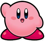
야생의 커비가 나타났다!!!
마무리
내용은 Rock’s Easyweb Youtube를 참고하였습니다.
해당 내용은 상기 블로그의 내용을 재구성하기 보다는 제가 이해하기 위해 정리한 것입니다.
더 자세한 내용은 해당 링크에 있으니 참고해주시면 감사하겠습니다.
그리고 CSS 속성 값들은 해당 속성을 Google에 검색하면 매우 자세히 나옵니다.
더 많은 요소들을 보고 싶다면 꼭 참고해주세요!
댓글남기기